
This survey came via one of the loops I’m on. Thought I may as well share my answers with you, too.
I’ll give you my demographics, too, so you can see where I’m coming from, and perhaps why my opinions are what they are.
23 years old, Celtic-Australian female in suburban Victoria. Am a reader, not an author. Not really into romance as a genre – I prefer it as a subplot rather than the main event.
1. What kind of covers do you like? I prefer photography, or illustration that looks close enough to resemble photography. I’m easily distracted by pretty colours, swirly things, prisms throwing rainbows, pretty cityscapes, gorgeous international architecture, etc.
2. How much detail should be on them? Maybe three things maximum on the front cover – character, setting and symbol. I’m happy to have a very detailed setting, but would prefer more anonymous character models.
3. Do you prefer characters or symbols, and why? Symbols. Would rather see something ABOUT the character, rather than the character his/herself. So pretty much symbols win by default 😉
4. What don’t you like on covers? I’m so over mantitty and clinch covers, and arse/boobs shots. I guess when you’re exposed to something so much, you become desensitised, and that’s pretty much the stage I’m in.
5. What would you prefer in digital artwork? Characters, or something to do with the story? Character faces are fine, but see my above note about T&A/naked torsos. So I guess I would prefer something to do with the story, but surely there’s room on the cover for both character and something that fits the story.
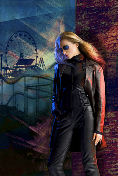
6. Links to covers you do like, both digital and ‘normal’. http://judyyork.com/collections/Fantasy3/imgs/5.jpg This is my favourite cover of all time, done by Judy York for Marianne Mancusi’s Razor Girl. Love the colours, love the setting, love the look of the character – of course, you need great writing to inspire a great cover commissioned just for the book. Think it has elements of both digital and normal. http://www.stygiandarkness.com/store/images/L_a_flash_of_hex.jpg This is Timothy Lantz’s cover for Jes Battis’s A Flash of Hex. This is illustrated, I think, but may also have digital elements. I love the smoke, the colours and the glowing things. http://samhainpublishing.com/graphics/1316.jpg And as for straight digital art, I recently found this gem by Kanaxa for Nicole Kimberling’s Happy Snak. It’s got the right balance of character, setting, and swirly colours. The font is also a good match for the genre.

I really don’t know what I like till I see it.
Aye, it’s much easier to know what I DON’T like.
I am not particularly fond of landscapes on covers. It screams boring to me. I like pretty much everything else.
Hugs, Tez!
~D~
Pingback: Cover Art Survey | Literary Escapism